Having a Privacy Center on your website lets you put all of your important privacy and compliance-related content in one place, while making it easy for your users to navigate and learn about your privacy practices.
If you're looking to upgrade your website with something to benefit both you and your users, consider adding a Privacy Center.
This article will look at the benefits of having a Privacy Center, and what components should go into one if you decide to create one.
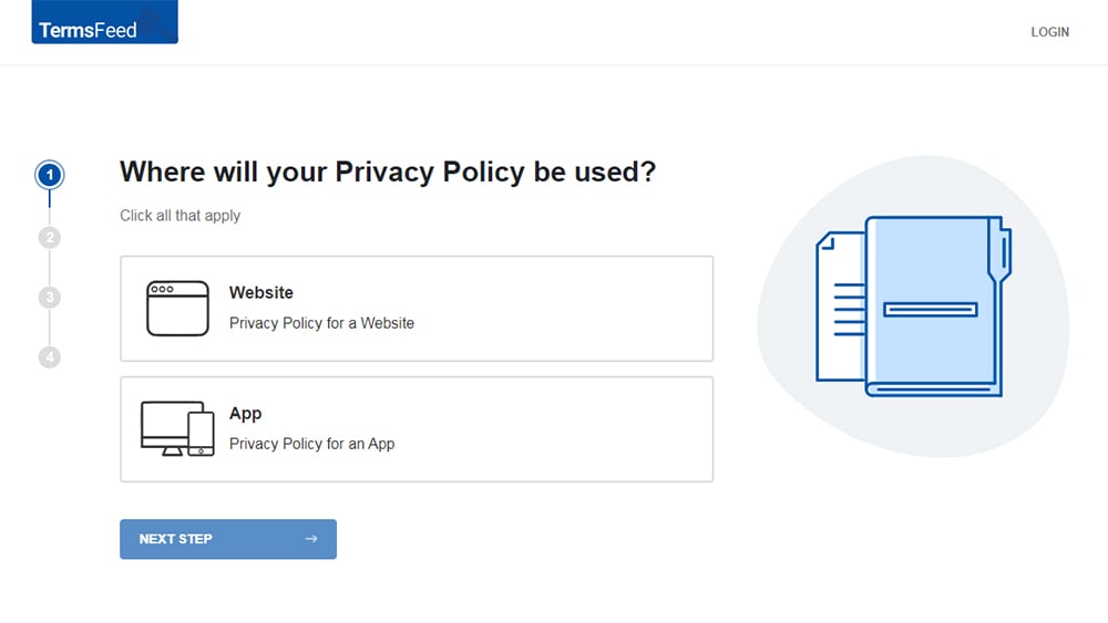
Our Privacy Policy Generator makes it easy to create a Privacy Policy for your business. Just follow these steps:
-
At Step 1, select the Website option or App option or both.
-
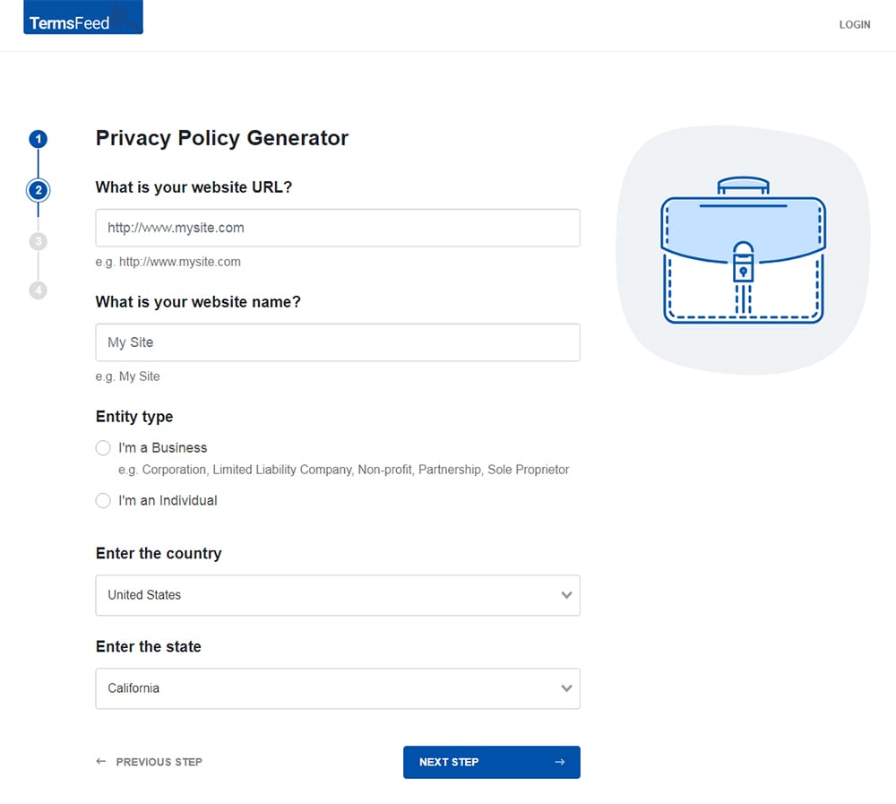
Answer some questions about your website or app.
-
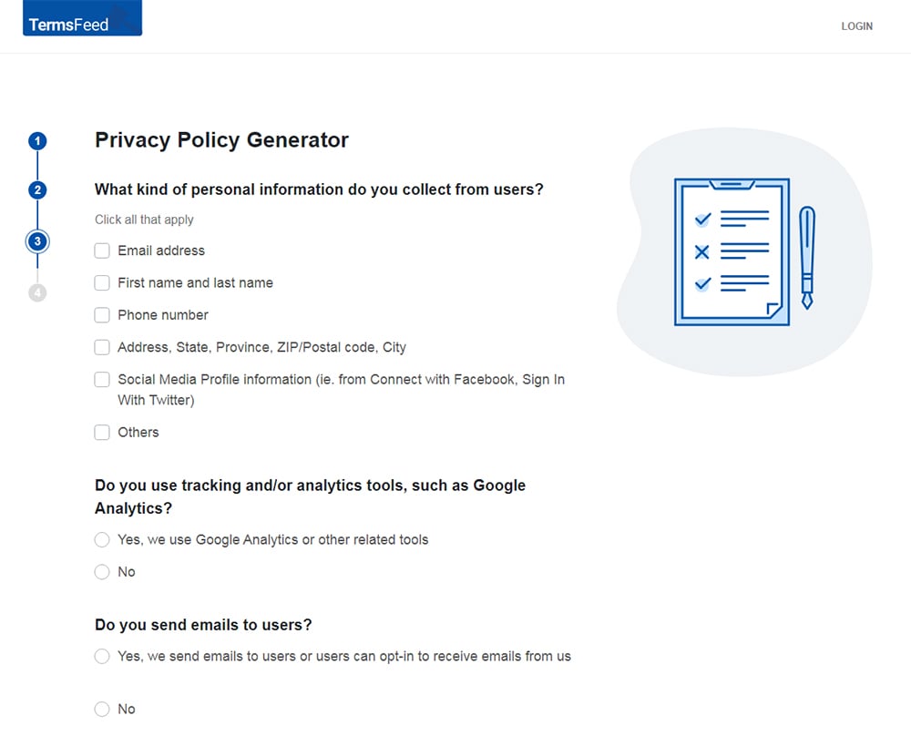
Answer some questions about your business.
-
Enter the email address where you'd like the Privacy Policy delivered and click "Generate."
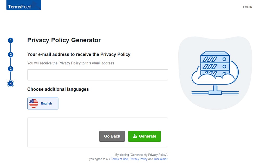
You'll be able to instantly access and download your new Privacy Policy.
- 1. What is a Privacy Center
- 2. When Should You Have a Privacy Center?
- 3. What Should a Privacy Center Include?
- 4. Examples of How to Design a Privacy Center
- 4.1. Put Links and Functionality at the Top (Walt Disney)
- 4.2. Include a Menu With Icons (Facebook)
- 4.3. Use Videos for Major Sections (YouTube)
- 4.4. Use Descriptive Photos and Images (Walmart)
- 4.5. Use Icons and Summarized Paragraphs (LinkedIn)
- 4.6. Promote Your Privacy Principles (eBay)
- 5. Summary
What is a Privacy Center
A Privacy Center is a one-stop place where users can find out anything and everything they need or want to know about the privacy practices of a company.
Privacy Centers tend to be interactive and well-organized, with a table of contents, menu items and icons to click on, a variety of sections to explore, and key information highlighted in a visual way.
As the Adobe Privacy Center says, the Privacy Center makes it easy to find information on topics related to privacy such as how a company collects and uses your personal information, and how you can control this.
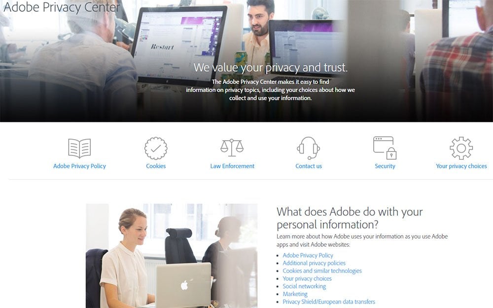
Note the use of eye-catching and easy-to-read icons, bullet-point lists and linked information.
A Privacy Center will typically be far more visually appealing and easy to navigate than a standard Privacy Policy agreement.
Compare the Adobe Privacy Center's readability with the readability of this big block of text from Google's old Privacy Policy page:
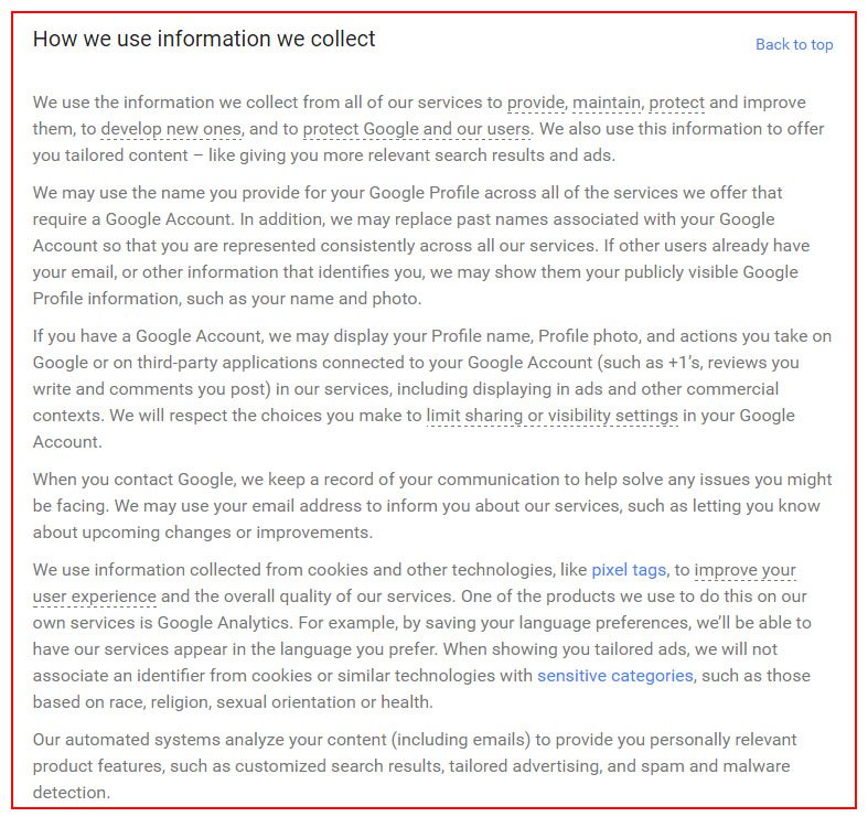
While all the same information is included in both places, and both are legally compliant ways of satisfying privacy laws, it's not difficult to see what format works best when you're trying to convey a lot of privacy information to your users in a way that's most accessible and easily understandable to them.
When Should You Have a Privacy Center?
Having a Privacy Center can be beneficial in a number of different circumstances:
-
If your website or mobile app collects an exceptionally large amount of user data. If you collect a huge amount of user data that you need to disclose, a Privacy Center will allow you to disclose this data without overwhelming your users. Trying to read through a long Privacy Policy document will be difficult, unenjoyable and confusing for your users, especially if they're just trying to find out one specific piece of information.
On the other hand, a Privacy Center is perfect for disclosing a lot of information in a really readable way.Having separate pages and links for different sections of information make it easy for a user to find relevant information without having to weed through paragraph after paragraph of dense text.
- If your website or mobile app collects sensitive user data. If you deal with data of a more sensitive nature such as financial information or medical record data, a Privacy Center can help you easily get your policies across on how you handle this sensitive data. Information that's exceptionally important to and sought out frequently by your users will be easy to locate.
-
If you really want to highlight the importance you place on security and privacy of user data. Having a Privacy Center versus just a Privacy Policy document just looks good. It shows your users that you take privacy very seriously - seriously enough to give it its own website and spend time designing a Privacy Center. If you have a client or customer base that would be more concerned with Privacy than some others, a Privacy Center shows you're serious about security of personal data. Because a Privacy Center can utilize space, icons, links and images, it's easier to read, navigate and understand than a basic Privacy Policy.
So, any time you think you and your users would benefit from this increased readability and navigation, a Privacy Center may be a good choice for you.
What Should a Privacy Center Include?
While every Privacy Center will be somewhat unique depending on the business itself, most Privacy Centers should include, at a minimum, the following things:
- A link to your legal agreements (Privacy Policy, Terms and Conditions agreement, Cookies Policy, etc.): These agreements help users understand how you use their data, what rights they have, and how they can use your platform according to your rules.
- A summary or FAQ section: Having this will help summarize important points to users so they can quickly and easily find key information regarding their privacy.
- Your contact information: Make it easy for users to contact you regarding questions they may have about how you use their personal data or anything else relevant.
Examples of How to Design a Privacy Center
Here are some examples of Privacy Centers and the way they're designed so you can see the components they usually include, as well as the variety in how you can design yours.
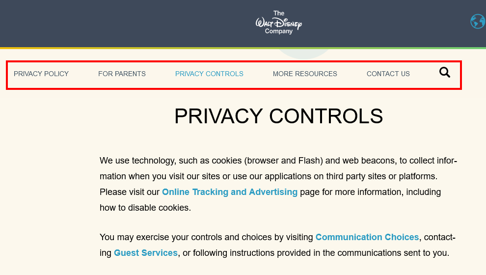
Put Links and Functionality at the Top (Walt Disney)
Walt Disney includes all the important links at the top, including a search feature and a contact option. Privacy Control options are the first things listed on the page to help users take control of their privacy quickly and easily:
Include a Menu With Icons (Facebook)
The Facebook's old Data Policy was broken down into a menu with icons and a question that will help a user locate which menu item he wants to review:
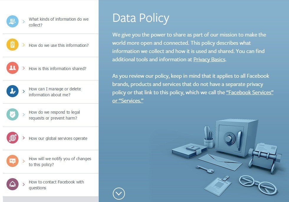
When a user clicked on any of the menu items on the left, the box expanded to show an easy-to-read bullet list of key information:
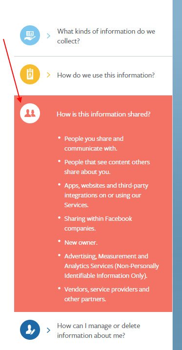
This is so much more convenient as well as easier to understand than a standard text-based Privacy Policy document.
The use of colors, icons, bulleted lists, short sentences, and interactive features made this an exceptional way to convey information to users.
Use Videos for Major Sections (YouTube)
It's not surprising that YouTube's old Policy Center homepage had a video as part of its introduction.
The use of a video as well as icons and broken-down sections really helped a user understand and feel comfortable with the Policy Center:
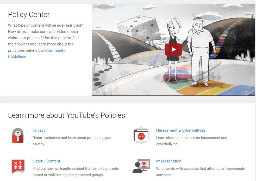
Note that this is a "Policy Center" and not just a "Privacy Center." While information related to privacy is included, so is other relevant and important policy information including links to the "Legal Policies" and "Additional Policies" of YouTube.
Including everything in one easy-to-navigate place is a smart move that helps users feel informed without feeling overwhelmed.
Use Descriptive Photos and Images (Walmart)
Walmart had a Privacy & Security page that used large photos and easy-to-read hyperlinked text to help users find what they're looking for.
The Walmart Privacy Policy page was listed first and foremost, but other helpful prompts like Fraud Alerts, Notices and a FAQ were included so users could quickly find what they may be looking for:
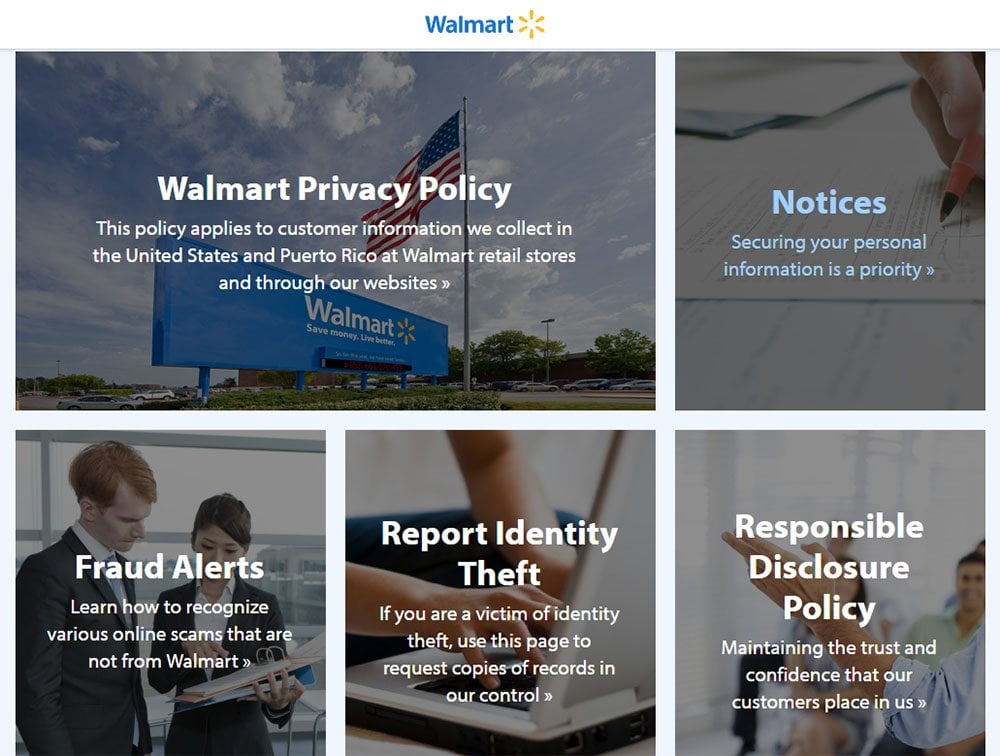
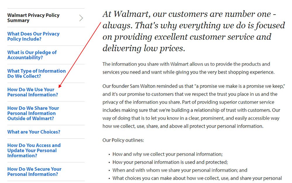
When a user clicked on the "Walmart Privacy Policy" photo and text link box, they were taken to the full text of the Privacy Policy. There was a hyperlinked menu on the left that made it easy for users to find what they were looking for:
Use Icons and Summarized Paragraphs (LinkedIn)
The LinkedIn Privacy Policy page utilized icons and summary paragraphs to make the policy easier to navigate and understand. There was also an intro video to help users feel comfortable and informed while looking at this policy:
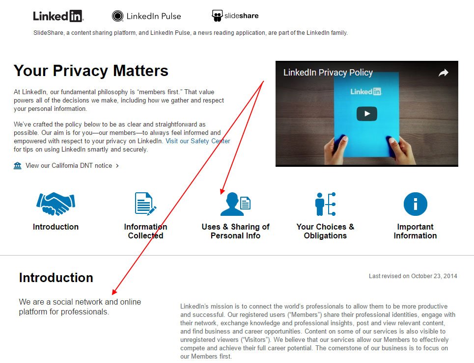
Users could click on an icon to be taken to that relevant section of the page, and then have access to the full text of the Privacy Policy:
![]()
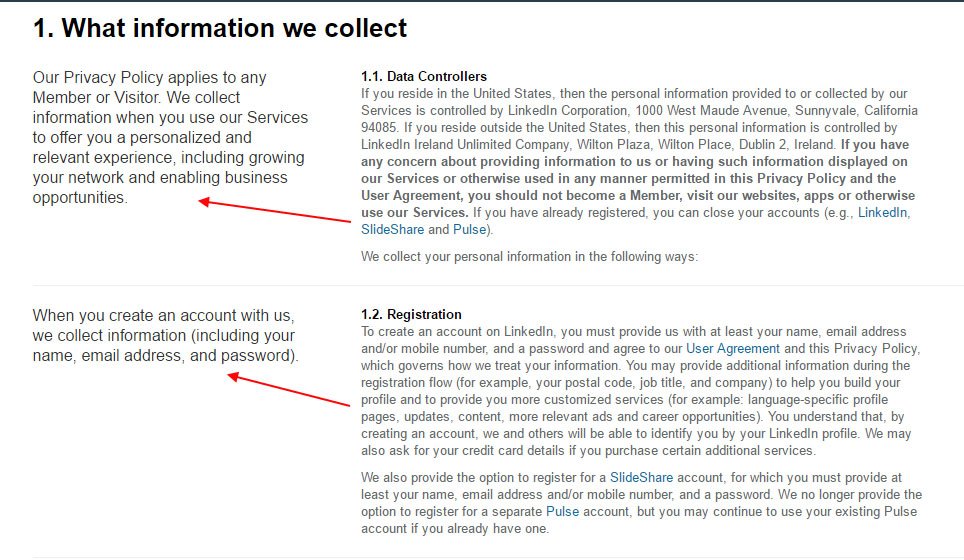
A short paragraph helped sum up the main points to take away from a section:
Promote Your Privacy Principles (eBay)
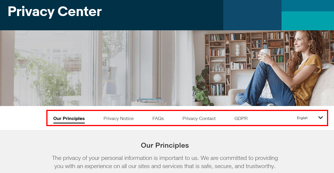
The eBay Privacy Center includes a summary of principles, as well as useful links to a FAQ, a way to contact the company, and even a method to change the language of the center to be more universally accessible and understandable:
Summary
If you're looking for a way to present a large amount of privacy information to your users, consider creating a Privacy Center.
By using images, videos, icons, colors, bulleted lists, pages and subpages, and interactive menus and features, you can present a lot of information to your users in a way that's easy to understand, easy to navigate, and visually appealing.
While a classic Privacy Policy page will always work, sometimes it can be a good thing to take that extra step to create a Privacy Center to display your policy details.

Comprehensive compliance starts with a Privacy Policy.
Comply with the law with our agreements, policies, and consent banners. Everything is included.
