Companies use a wide variety of opt-in forms on their websites these days. Each has a purpose, and they're essential for (mainly) email marketing campaigns and other communications efforts. They're also an ideal spot to include a link to your business' Privacy Policy.
In this article, we will discuss the most common forms and how to use them properly. We'll also provide examples of each type so that you can see how they work.
There are two main reasons why you need a Privacy Policy:
✓ Privacy Policies are legally required. A Privacy Policy is required by global privacy laws if you collect or use personal information.
✓ Consumers expect to see them: Place your Privacy Policy link in your website footer, and anywhere else where you request personal information.
Generate an up-to-date 2024 Privacy Policy for your business website and mobile app with our Privacy Policy Generator.
One of our many testimonials:
"I needed an updated Privacy Policy for my website with GDPR coming up. I didn't want to try and write one myself, so TermsFeed was really helpful. I figured it was worth the cost for me, even though I'm a small fry and don't have a big business. Thanks for making it easy."
Stephanie P. generated a Privacy Policy
What are Opt-In Forms?
Opt-in forms are a type of form where customers "opt-in" (hence, the name). In other words, they actively choose to participate in the marketing activity you're presenting them. They allow you to gather information from your customers, process orders, and track interactions.
Different types of opt-in forms come with many benefits. For instance, the right forms can help you:
- Build your audience
- Get more leads
- Get more subscribers
- Increase revenue
Most of the time, the customer willingly decides to give up some personal information in exchange for something you're offering, whether that's:
- Information delivered by email
- A free report
- Checklist
- Whitepaper
- Case study
The main takeaway here is that opt-in forms are an effective marketing tool that can help you grow your customer base and keep it growing.
Why You Might Use Opt-In Forms
If you're not using opt-in forms on your website, you're missing out on a powerful lead generation tool.
Here are four reasons you should use opt-in forms to capture leads from your website visitors:
- They're an effective way to collect contact information from potential customers
- They can generate leads that are warm and ready to buy
- Opting in shows that a visitor is interested in what you have to offer
- Opt-in forms make it easy to follow up with potential customers
Note that, in general, using opt-in forms is a "set and forget" activity.
You set the form up, and it automatically collects a customer's information without any further effort on your part. Customers can also visit your website and interact with your opt-in forms from any device.
Finally, it's easy to track how well your opt-in form is performing so you can make any adjustments necessary to boost your conversion rates.
Types of Opt-In Forms

The truth is that there are a wide array of opt-in forms out there. Therefore, for this article, we'll discuss those that are most common.
In-line/After Post
After-post opt-ins are a great way to get your audience engaged with you. If they've read the whole post, it means they like what you have to say and want more of it! That makes them prime prospects for your offer or content upgrade.
That's when you hit them with an after-post opt-in, which is an opt-in box placed, as the name suggests, at the end of a blog post. They are essentially the same as in-line opt-in forms, which are usually placed somewhere in the body of a blog post or article.
These types of opt-in forms are also typically static and are embedded in the article or blog post.
In-line/after post opt-in forms are a great way to collect email addresses and other personal information from people who are already interested in what you have to say. They're also less intrusive than pop-ups.
However, there's no guarantee that everyone who reads your post will scroll down to the end, so this type of opt-in form may not be as effective as other forms.
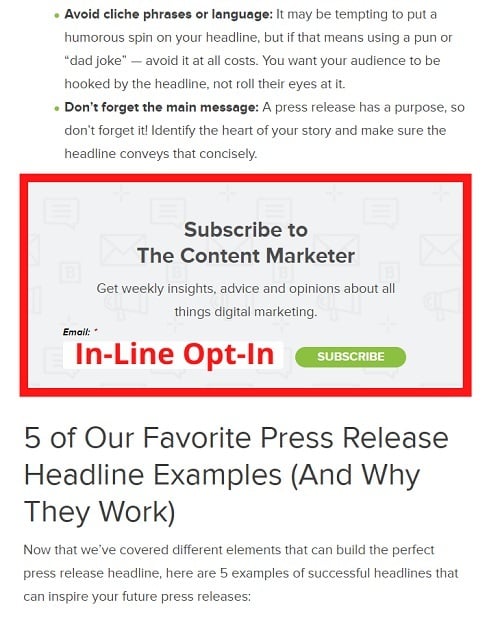
Here's a great example from the content marketing agency, Brafton.
Take a look at how it uses an in-line opt-in form right smack dab in the middle of a blog post:
The Floating Bar
A more dynamic opt-in form is the floating bar. They typically appear either in the header or footer of a website. They can be static or dynamic (they slide into view as the user scrolls). They can also be made to remain in view even when the user scrolls down or up the page.
Additionally, this opt-in type doesn't impact the user experience much since it "floats" over the content.
However, a downside is the fact that it can be too subtle for some audiences, and in that case, your conversion rates could suffer. Moreover, many companies get it wrong when trying to use a floating bar in the footer. Essentially, the bar ends up covering essential links and other information.
If you do not see the desired results, try making the bar more noticeable or change its content.
You can also combine the use of a floating bar opt-in with more traditional, static opt-in forms you might see in a sidebar or in-line with text.
Here's an excellent example from TruConversion of a floating bar in the header.

Notice how the floating bar sits just above a much larger email sign-up form.
Full Screen Overlays
Full screen opt-in overlays are pop-ups that appear when a visitor first arrives on your website. Some call them "Welcome mats." Now, some also believe that you can never be too aggressive when it comes to driving conversions on your website.
A full-screen opt-in is precisely that, pushy. It takes over the user's entire screen and can be a great way to capture the attention of your visitors and get them to take the action you want them to take.
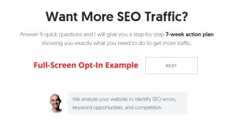
By using an overlay, you can ensure that all your visitors see your message, no matter where they are on your page. Some marketers like Neil Patel use these types of opt-ins along with exit intent for maximum effect.
Here's an example from Neil Patel's SEO tool, Ubersuggest. When a visitor moves their mouse cursor that looks like they're going to exit the site, the following full-screen opt-in pops up:
Slide-In Forms
Have you ever seen those slide-in opt-in forms that seem to magically appear on the side of websites? When your website's visitors read your page, the slide-in form literally just slides in and does its thing.
One of the main benefits of a slide-in opt-in form is that they're an unobtrusive way to keep your content in front of visitors without interrupting them. They also work well with exit-intent technology to ensure that you don't lose any potential leads.
Sidebar Opt-Ins
Sidebar opt-in forms are some of the most common, hands down. Literally hundreds of thousands of businesses use them. That's true whether the company has embedded the form in the website's code, or it's placed in the widget area of a site based on WordPress.
Although it's highly visible, one of the downsides is that people have become used to the fact that most websites have some kind of a form in the sidebar. Therefore, they may tend to ignore them. On the plus side, sidebar opt-ins are usually visible on every website page and blog post.
Here's how ProBlogger uses a sidebar opt-in on its blog. Again, the sidebar opt-in is one of the most standard across all industries and can be easily integrated into almost all website designs:

Opt-in Consent

These days you can't talk about using opt-in forms for marketing and communications purposes without also discussing the need to obtain consent.
While we touched on this issue above, it needs to be repeated. Privacy laws such as the GDPR in Europe, and The Brazilian General Data Protection Law (LGPD), demand that organizations operating within their borders or offering goods or services to their residents must obtain active, aware consent before the customer opts in.
On the flip side, if you do business in the United States of America, you need to be aware that many states, such as California, now demand that you provide an easy way for customers to opt out from your marketing and business communications.
Your Privacy Policy should outline your opt-in practices, the fact that you require consent, and how you allow users to opt out.
Obtaining Consent
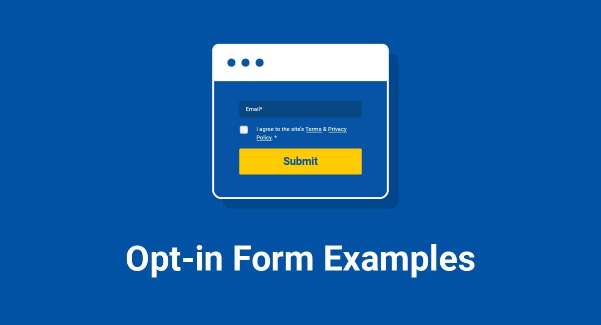
To get active, aware consent before a customer opts-in, you can add an unmarked checkbox to your opt-in form along with links to your Privacy Policy and Terms of Service Agreement, like this:
![]()
Clickwrap
You can easily do that through what's known as a "clickwrap agreement," which allows users to click an "I accept" or "I agree" checkbox.
Many websites use some kind of statement such as: "By clicking the button below, you indicate that you've read our Privacy Policy and agree to our Terms of Use."
Here's an example:
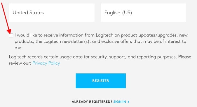
They then place the button or checkbox under that statement.
The point is that the statement and clickwrap are integrated into the bottom of the opt-in form.
Here's an example as shown by FormAssembly:
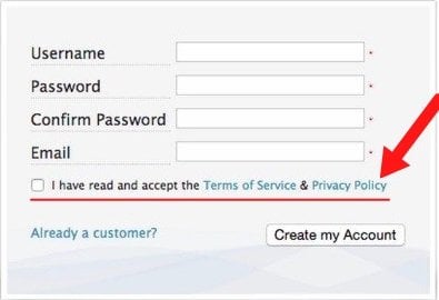
Here's another example:
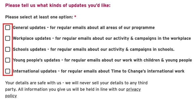
Browsewrap
Just as you can't talk about opt-in forms without talking about consent, you can't talk about clickwrap without mentioning browsewrap agreements. Many people get the two confused, but you shouldn't.
In contrast to a clickwrap agreement, browsewrap agreements assume consent. They typically link to a Privacy Policy and Terms of Service agreement, but they have language such as:
"Please view our Privacy Policy and Terms of Service. If you choose to continue using our website, you indicate that you accept these agreements and agree to be bound by them."
Here's an example from Hewlett Packard's website as seen on Wikispaces.psu.edu:

And another:
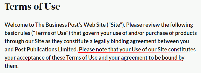
Some even place a checkbox on the form, but it's already marked, again assuming consent. This is a practice many find unethical and somewhat deceptive. It's also not allowed under the GDPR.
Because of the demands made by international privacy laws, there is a clear move away from browsewrap and implied consent, and instead toward clickwraps, which allow full GDPR compliance.
Summary
Choosing opt-in forms can be overwhelming given all the various types and use cases. But knowing your audience, the right incentive to offer, and testing will help you arrive at the perfect opt-in for the best conversion rates.
It's also recommended that you use a handful of opt-in form types on your site. You should use one for primary lead generation (from active opt-ins like pop-ups) and ideally two others for secondary lead generation (from passive opt-ins like embedded forms).
Remember, the primary types of opt-in forms available today include:
- In-line/After posts
- The floating bar (either in the header or footer)
- Full-Screen Overlays (also known as Welcome Mats or Site Covers)
- Slide-in forms
- Sidebar forms
Such a collection will help you target all kinds of visitors coming onto your site and enable you to potentially capture more leads.
Recall that you must obtain active, aware consent from customers if you wish to comply with laws on both hemispheres, such as the GDPR and LGPD.
The best way to do that is to integrate a clickwrap agreement with your opt-in forms.

Comprehensive compliance starts with a Privacy Policy.
Comply with the law with our agreements, policies, and consent banners. Everything is included.
