The "click to accept" method is the most common approach when it comes to getting users to agree to your Terms and Conditions (also known as Terms of Use or Terms of Service), Privacy Policy and other important legal agreements.
This article will explain why, and show some examples so you can implement "click to accept" on your own platform.
"I Agree" Checkbox by TermsFeed tool can help you enforce your legal agreements in 3 easy steps.
-
Step 1. Adjust the settings in order to display your legal agreements properly.
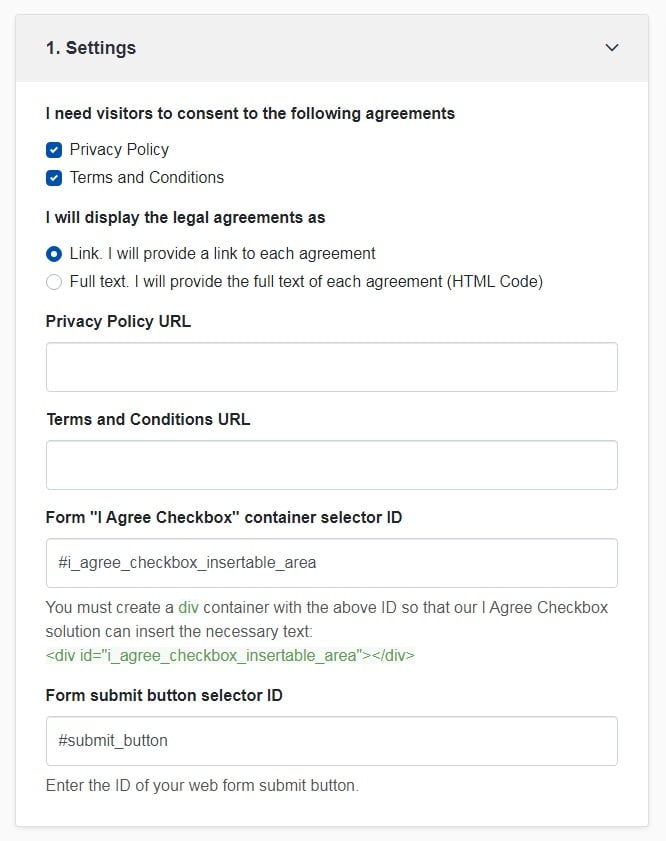
-
Step 2. Customize the style to match your brand design.
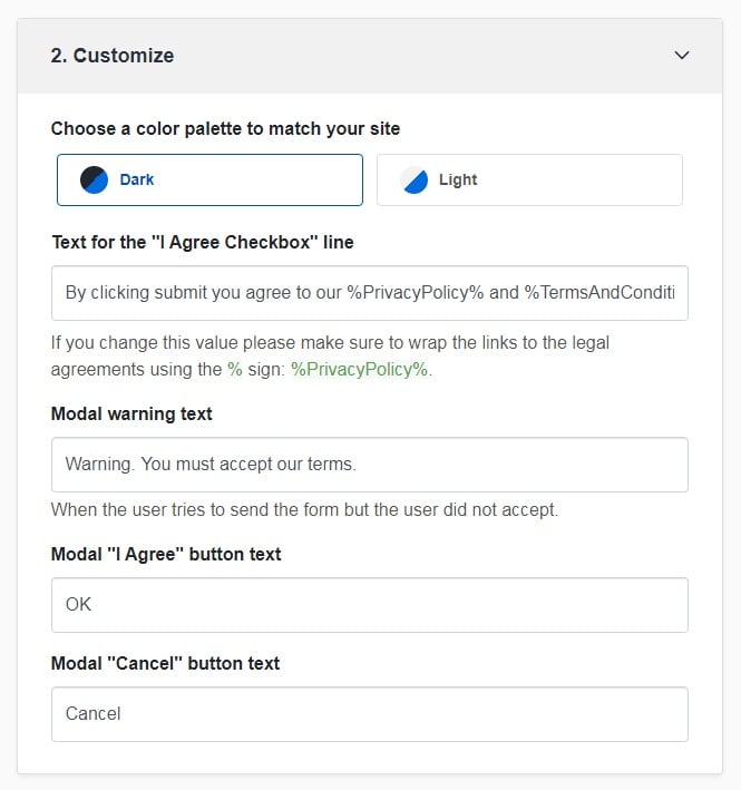
-
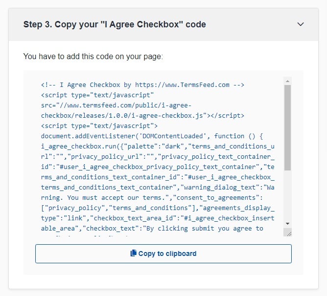
You're done! Just copy the generated code from Step 3 and copy-paste it on your website.
- 1. Getting Users to Agree to Your Important Legal Terms
- 1.1. The Outdated, Insufficient Browsewrap Method
- 1.2. The Modern, Preferred Clickwrap Method
- 1.3. Examples of Clickwrap Methods
- 1.3.1. When Creating a New Account
- 1.3.2. In Contact Forms and Communications Sign-Ups
- 1.3.3. In Ecommerce Checkout Forms
- 1.4. Click to Accept: The No-Checkbox Method
- 2. Summary
Getting Users to Agree to Your Important Legal Terms
There are two main methods of doing this, which are known as clickwrap and browsewrap.
The Outdated, Insufficient Browsewrap Method
Browsewrap is a passive method of having users accept your legal agreements and be bound by them.
A typical browsewrap agreement includes phrases that state that by using, accessing, or creating an account, or browsing a website, the user will be considered to have accepted the agreement of the website.
Below is an example of a very typical browsewrap agreement presented by The Business Post in its Terms of Use agreement:
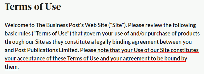
Note how the last sentence states how "your Use of our Site constitutes acceptance of these Terms of Use and your agreement to be bound by them."
All a user must do to be deemed as accepting this Terms of Use is to use the Business Post's website.
Browsewrap methods are typically held to be unenforceable in courts because they aren't conspicuous enough. The logic here is that users can't be held to have accepted terms by simply browsing a web page or taking some other basic and generic action that in no way shows they accept terms or are even aware that terms exist.
This is especially true since the passing of the General Data Protection Regulation (GDPR) in the EU in 2018. Under the GDPR, any time you obtain consent it must be obtained in a way that's clear and affirmative - such as with a checked box. The GDPR basically does away with browsewrap, making it not up to modern standards of consent.
The Modern, Preferred Clickwrap Method

The clickwrap method is an active method of getting users to accept your legal agreements. Clickwrap requires that a user clicks something - a checkbox, a linked button, etc. - that shows that the user intends to accept or agree to your agreement.
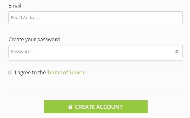
For example, here's a standard clickwrap presentation where a user must actively check a box next to a statement that hows they're agreeing to the Terms of Service when signing up for an account, and the legal agreement is linked in the text for easy access and quick reference:
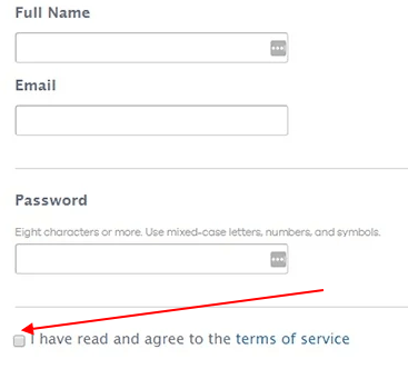
Clickwrap is preferred over browsewrap because clickwrap generally leaves little to no doubt that a user intended to be bound to your legal agreements.
Having undoubted, provable consent is important in the event that a legal issue or conflict arises between your business and a user.
Take, for example, the court case of Sgouros v. TransUnion Corp. that involved a click-to-accept button, a Service Agreement with an arbitration clause in it, and an unhappy customer.
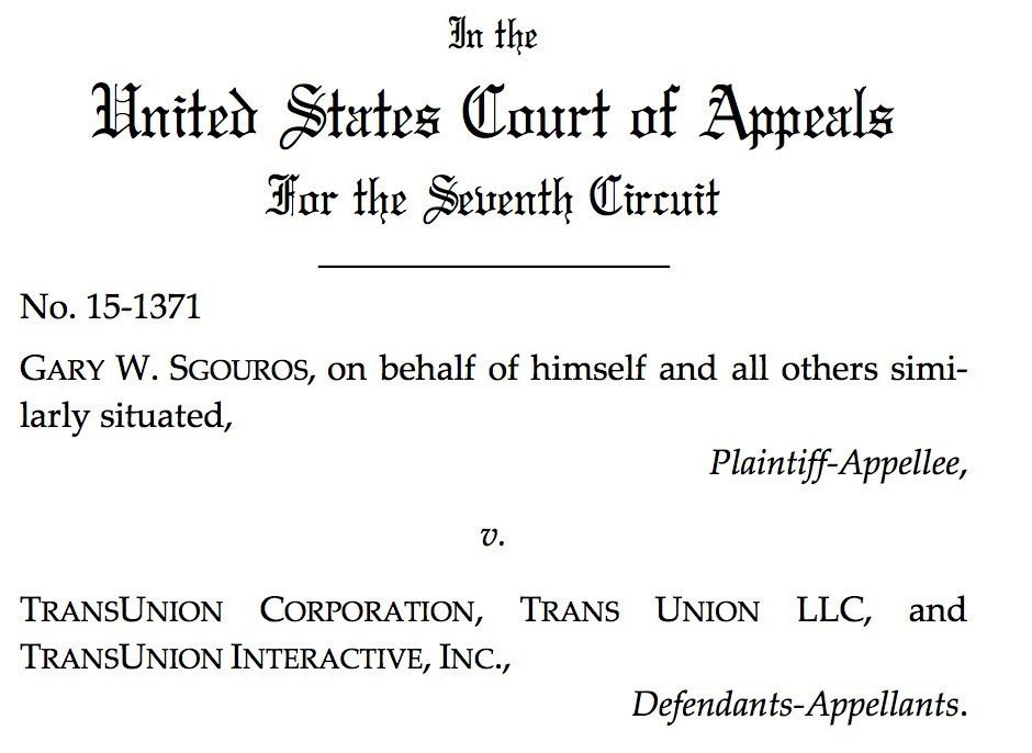
The customer in this case was dissatisfied with the TransUnion credit reporting due to the report being inaccurate and he filed a class action lawsuit against the company.
TransUnion had included an arbitration clause in its Service Agreement and sought to compel arbitration. The plaintiff then claimed that he was not bound to the terms in the agreement because the terms were not adequately disclosed.
Here's what the page looked like where the plaintiff was presented with TransUnion's Service Agreement, text that defined what clicking the "I Accept & Continue to Step 3" button would do, and the "I Accept" button. (Image taken from here.)
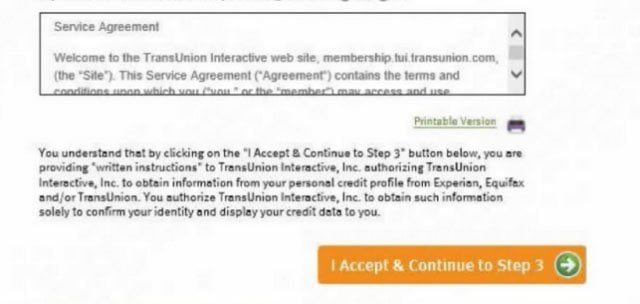
TransUnion claimed that this clickwrap was adequate enough to find that the plaintiff should be bound by the terms of the Service Agreement.
To determine whether this was an acceptable method of clickwrap, the court used a two-part test.
Enter the "reasonable communicativeness" test.
This test considered the following two issues:
- Whether all of the terms and conditions of the agreement in question were adequately communicated to the consumer via the web pages, and
- Whether an assumption could be supported by the circumstances that the consumer had reasonable notice of the terms in question.
The court found that the TransUnion disclosure was insufficient for a number of different reasons.
First, there's nothing on the page that states that a consumer is going to be subject to any terms and conditions or that any terms and conditions even exist.
The scroll box space where the Service Agreement is located is very small and shows very limited text, none of which puts a consumer on notice that he will be bound by any terms in the Service Agreement or that the text in the box is even important.
Next, the small text located between the scroll box and the "I Accept" button states:
By clicking on the "I Accept..." button below, you are providing "written instructions" to TransUnion Interactive, Inc. authorizing TransUnion Interactive, Inc. to obtain information from your personal credit profile from Experian, Equifax, and/or TransUnion. You authorize TransUnion Interactive, Inc. to obtain such information solely to confirm your identity and display your credit data to you.
There's no mention that by clicking the "I Accept" button you are accepting the terms of the Service Agreement. In fact, quite the opposite because a user would rightfully assume that by clicking the button, they are doing exactly what TransUnion stated, which does not involve agreeing to any terms.
Other issues that the court pointed out that worked against finding the disclosure to be sufficient includes the following:
- The consumer wasn't required to click on or scroll through the scroll box.
- The hyperlinked version of the Service Agreement located near the box was labeled only with "Printable Version." This downplayed its importance.
The court held that the scrollable box on its own is insufficient to create an agreement, and based on the above factors, the only real reference to any of the agreement terms was within the scroll box and nowhere else.
These issues could have been solved by adding noticeable and clear text:
- Either near the Service Agreement scroll box, within the visible portion of the box
- Or in the paragraph above the "I Accept" button that gave a consumer notice that the purchase would be subject to the terms and conditions of the service agreement.
As a result of this case, clickwrap agreements should strive to meet the two-part "reasonable communicativeness" test by adequately communicating terms to consumers.
Don't just hide the terms in a small scroll box or in a way that downplays their importance or relevance to the consumer. If a consumer will be bound by terms, he should be informed of that as blatantly as possible and in a clear and reasonable way.
Examples of Clickwrap Methods

Here are a few examples of adequate clickwrap methods that use checkboxes or "I Agree" buttons to successfully let users know about terms and obtain agreement to these terms.
When Creating a New Account
When people create a new account with your website or mobile app, this is the perfect time to get them to agree to your Terms and other legal agreements.
Amazon AWS uses a checkbox that users must click before creating an account. This checkbox is next to a sentence that says, "Check here to indicate that you have read and agree to the terms of the AWS Customer Agreement."
This box must be checked before an account can be created.
The AWS Customer Agreement is linked for convenience for the user and to show that the agreement is important. The language used makes sure a user knows that by checking that box and then clicking Create Account and Continue, an agreement will be formed:

Before registering to use a service, you can request that new users must check a box to state that they've read and agree to your Terms and Conditions agreement (or any other legal agreement).
This process leaves no doubt that anyone who both checks the box and clicks Register is intending to agree:

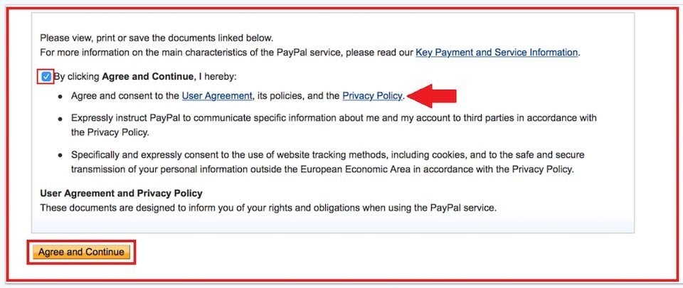
PayPal makes it very clear that there's an agreement between registering users and PayPal, the company.
Users must click a checkbox that states, "By clicking Agree and Continue, I hereby agree and consent to the User Agreement, its policies, and the Privacy Policy."
The word "Agree" is also included in the button that the user must click on to create the account:
In Contact Forms and Communications Sign-Ups
Another common, useful place to have users click to accept your terms is where users request to communicate with you. This can be in a general contact form, or during the process of signing up to receive email communications and marketing/promotional content from you.
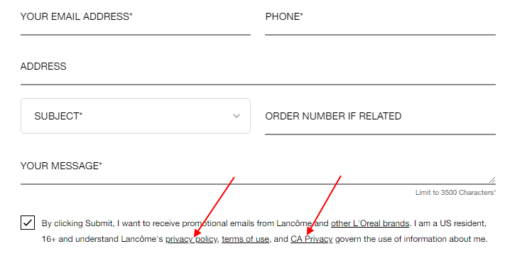
Here's how Lancome gets agreement for its Privacy Policy, Terms of Use and dedicated California Privacy Policy in its contact form:
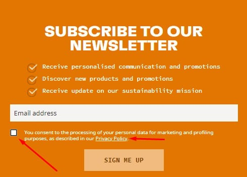
Timberland has users click a box next to a statement that explicitly uses the word "consent" in regard to its privacy practices and Privacy Policy in its email newsletter subscribe form:
In Ecommerce Checkout Forms
You can use the "click to accept" method during an online checkout process for your ecommerce store to get agreement to your terms.
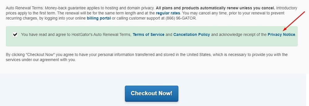
Here's how HostGator does this with a checkbox just before the final checkout button is displayed:
While these examples of clickwrap use checkboxes to gain agreement from a user, this isn't absolutely necessary.
Simple "click to accept" methods are equally effective and binding if done correctly. Let's look at how that can be done.
Click to Accept: The No-Checkbox Method

Here are a few examples of "click to accept" clickwrap methods that don't require a separate checkbox click, but still do a successful job of letting users know that by clicking, they're agreeing to terms.
Microsoft lets users who create new accounts know that "clicking Create account means that you agree to the Microsoft Services Agreement and privacy and cookies statement."
There is no checkbox required:

This clear language and hyperlinked policies made readily available let users know that there are important agreements to read, provides these agreements, and makes it clear that by clicking "Create Account," an agreement will be formed between the user and Microsoft, the company.
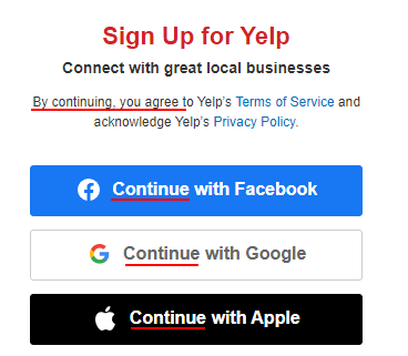
New users who are signing up for a Yelp account are informed that "By continuing, you agree to Yelp's Terms of Service and acknowledge Yelp's Privacy Policy."
This is stated immediately above the "Continue with" buttons, and links to the relevant Terms and Privacy Policy of Yelp are included, which puts new users on notice that an agreement will be formed upon sign-up.
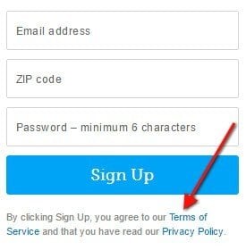
Here's an example of how you can place text below but very close to the "Sign Up" button that lets users know that "by clicking Sign up, you agree to our Terms of Service and that you have read our Privacy Policy."
Both agreements are linked and done so in a brightly-colored font to draw attention to them.
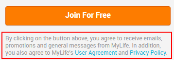
MyLife allows users to create free accounts and lets them know that "by clicking on the button above, you agree to receive emails, promotions and general messages from MyLife. In addition, you also agree to MyLife's User Agreement and Privacy Policy."
The User Agreement and the Privacy Policy are both linked, in brighter-colored font than the surrounding text, and they're located next to the "Join for Free" button.
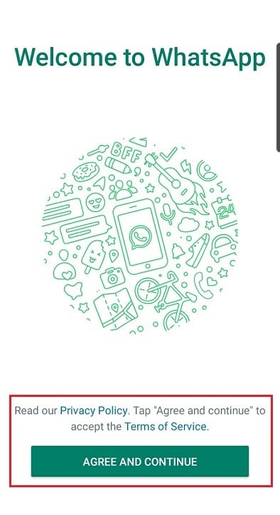
When a user downloads WhatsApp and opens the app for the first time, they're presented with a welcome screen where they're requested to tap "Agree and continue" to accept the Terms of Service. This is a great way to get clear consent in a mobile app interface:
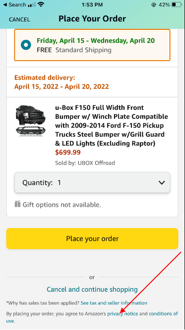
And here's how Amazon's mobile site states to shoppers that "by placing your order, you agree to Amazon's Privacy Notice and Conditions of Use." This statement is located close to the "Place your order" button:
Summary
When using clickwrap to obtain agreement to your terms, remember to make sure that you communicate these terms adequately to your users. Make sure that users have notice that the terms exist and that by taking some action they will be held to be in agreement with the terms.
While the checkbox isn't necessary, as seen in examples above, this extra required action by your users is favored by courts and is a best practice of clickwrap methods.

Comprehensive compliance starts with a Privacy Policy.
Comply with the law with our agreements, policies, and consent banners. Everything is included.
